The first MINI appeared in 1959, and its logo was far from what we know today. The Morris Mini-Minor and Astin Seven models, produced by the British Motor Corporation (BMC), were the first to leave the production line, but the British icon was on the market until 2000, when the BMW group acquired the brand and starts the process of evolution of the MINI as we know it today.
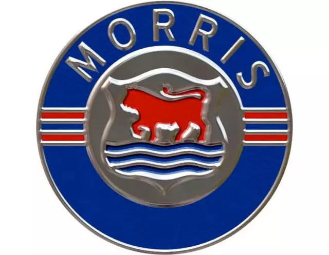
The first Morris brand logo was represented by a red ox and three blue waves - the symbol of the city of Oxford - which appeared inside a circle with two stylized wings to the left and to the right.
In contrast, the Austin Mini, which appeared from 1962 onwards, displayed a hexagonal logo above the radiator grille, showing the brand's inscription and emblem.
From 1969, when it started to be produced exclusively at the Longbridge factory in the United Kingdom, it received the Mini designation for the first time, with a classic emblem of abstract design that had no resemblance to the original symbols. The so-called Mini shield remained in use for decades, its design being adapted several times.
In 1990, a new generation of Mini once again received a new logo, returning to the traditional design and focusing on the sporting merits achieved so far. A chrome wheel with stylized wings appeared instead of the ox and the waves, and the red inscription “MINI COOPER” appeared with a green crown on a white background.

In 1996, this variant was applied to the other models with a modified bottom and the inscription “MINI”.
Just a few years later, during preparations for relaunching the brand — which is now owned by the BMW Group — the logo design most recently used for the classic Mini was taken as a foundation and consistently modernized. The modern MINI appeared with a three-dimensional design logo with brand inscription in white against a black background. The chrome circle and stylized wings have remained unchanged for nearly 15 years and have made the symbol familiar worldwide.
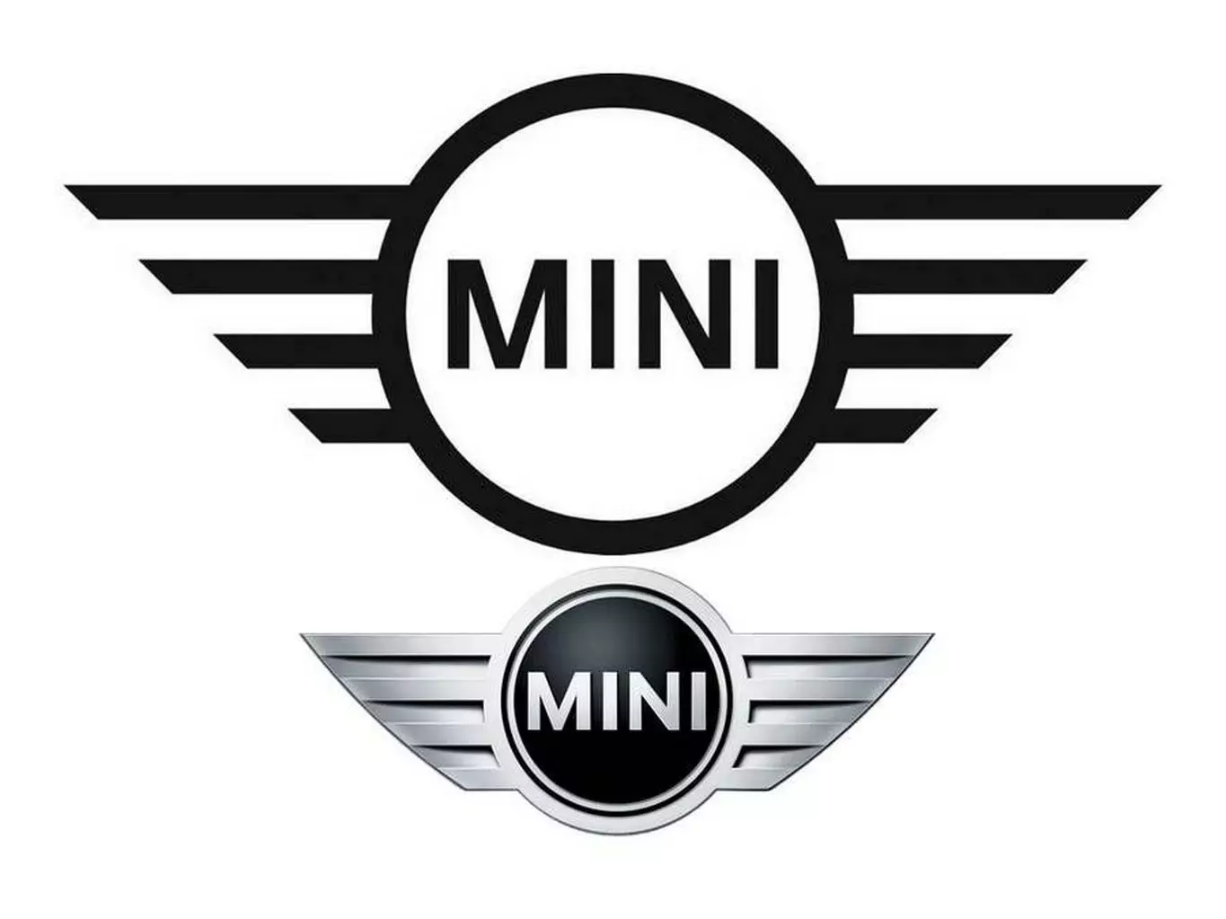
The new logo is thus intended to highlight stylistic elements from the early stage of the classic Mini with a future-oriented look.
The new interpretation of the logo takes the form of a scaled-down design that focuses on the essentials while remaining familiar, with capital letters in the centre. It builds on the three-dimensional style of representation that has existed since the brand's relaunch in 2001, applying this to a form of visual expression known as “flat design” that integrates the main graphic elements.
The new MINI logo is simpler and clearer, abandoning gray tones and concentrating only on black and white, intending to demonstrate the clarity of the brand's new identity and its character, thus reflecting a clear commitment to the British brand's tradition , which now spans nearly 60 years. Will be present on all MINI models from March 2018 , appearing on the bonnet, rear, steering wheel and key control.
