also the Volvo decided to follow the latest trends in logo design when redesigning its own, making it much simpler and minimalist.
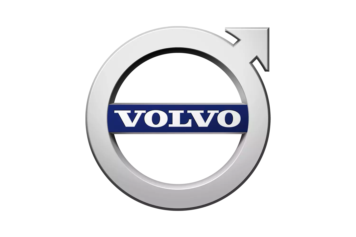
The three-dimensional effects and even the presence of color were left out, with the various elements of the logo being reduced to the maximum, without effects: the circle, the arrow and the lettering, with the latter keeping the same serif font (Egyptian ) typically Volvo.
The choice for this path, inserted in the current flat design, is justified by the same reasons that we have seen in other brands. The reduction and monochrome (neutral colors) allow a better adaptation to the digital reality we live in, benefiting its readability, being considered more modern.
Although the Swedish brand has not officially advanced yet, with no announcement about its new logo, it is said to start to be flaunted by its models from 2023 onwards.
As a curiosity, the circle with the arrow pointing upwards is not the symbolic representation of the masculine, as it is often interpreted (the symbols are identical, so no wonder), but rather is a representation of the ancient chemical symbol of iron — material to which it intends to associate the characteristics of quality, durability and safety — a symbol that has accompanied Volvo since its creation in 1927.