
The unveiling of the BMW Concept i4, in addition to foreseeing the future… i4, which doesn't seem to be more than the next generation of the 4 Series Gran Coupé, but 100% electric, “hidden” another novelty. On its bonnet, just above the (massive) double rim, the new BMW logo can be seen for the first time.
New? Well, it's effectively a redesign of the logo we were already familiar with — the structural elements that accompany the Munich brand logo have remained unchanged since the brand's founding in 1917.
Namely, the circular shape, the stylized helix — it's not actually a helix — and the lettering at the top with the letters following the circular shape. The evolution of the BMW logo from its origins to its new version:
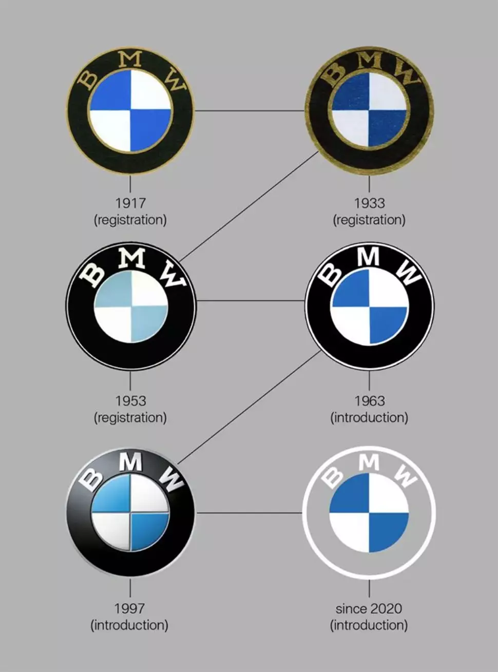
As we have seen in other brands, such as Volkswagen, BMW also adhered to the two dimensions, following the procedures of flat design, losing the perception of volumetry of the predecessor, which had light/shadow areas.
The simplification of the new version also makes it more suited to today's digital reality, making its application easier.
The highlight is the elimination of the black rim where the letters "BMW" are positioned, making it transparent — it became visually lighter and this transparency adds new values of clarity and openness — with the new logo being delimited by a line a White.
We will progressively see the application of the new logo in various BMW communication materials, but for now, we will not see it applied to the brand's models — despite having been introduced on the Concept i4 — or in the identification of points of sale.