
Leonardo da Vinci already said that “simplicity is the ultimate degree of sophistication”, and judging by the Volkswagen logo, this is a theory that also applies to the world of four wheels, as far as logos are concerned. With just two letters – a V over a W – surrounded by a circle, the Wolfsburg brand managed to create a symbol that would later characterize the entire automotive industry.
In fact, the Volkswagen logo story is the target of some controversy. The emblem's origins date back to the late 1930s, when the German brand took its first steps in the sector. Upon the inauguration of Volkswagenwerk, a factory in northern Germany, Volkswagen will have launched an internal competition for the creation of a logo. The winner turned out to be Franz Xaver Reimspiess, an engineer who was also responsible for improving the engine of the famous “Carocha”. The logo – with a gear, symbol of the German Work Front – was officially registered in 1938.
However, Swede Nikolai Borg, a design student, later claimed legal rights to the logo, claiming that he had been given express orders by Volkswagen to start developing the emblem in 1939. Nikolai Borg, who later created his own design agency advertising, he swears to this day that he was responsible for the original idea of the logo. The Swedish designer tried to take legal action against the brand, but it dragged on over the years due to lack of evidence.
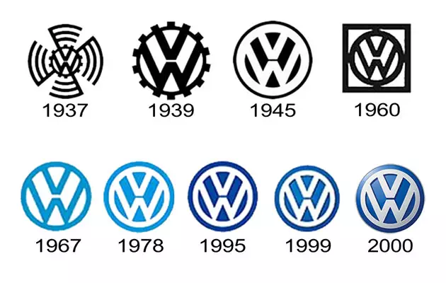
Since its creation until today, the Volkswagen logo has not undergone significant changes, as you can see from the image above. In 1967, blue became the predominant color, associated with the loyalty and trust we recognized in the brand. In 1999, the logo gained three-dimensional shapes, and more recently, a chrome effect, highlighting Volkswagen's desire to remain current without giving up a familiar emblem.