Although it is currently recognized as one of the biggest car manufacturers in Europe, Peugeot started by manufacturing… coffee grinders. Yes, they read well. Born as a family business, Peugeot went through various industries until settling in the automobile industry, with the production of the first combustion engine at the end of the 19th century.
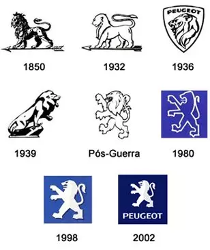
Returning to the mills, around 1850, the brand needed to distinguish the different tools it manufactured, and therefore registered three distinct logos: a hand (for 3rd category products), a crescent (2nd category) and a lion (1st category). As you may have guessed by now, only the lion has survived the passage of time.
NOT TO BE MISSED: The history of logos – BMW, Rolls-Royce, Alfa Romeo
Since then, the logo associated with Peugeot has always evolved from the image of a lion. Until 2002, there were seven modifications made to the emblem (see image below), each one made with a greater visual impact, solidity and application flexibility in mind.

In January 2010, on the occasion of the 200th anniversary of the brand, Peugeot announced its new visual identity (in the highlighted image). Created by the brand's team of designers, the French feline gained more minimalist contours but at the same time dynamic, in addition to presenting a metallic and modernist look. The lion also freed itself from the blue background to, according to the brand, “better express its strength”. The first vehicle to bear the brand's new logo was the Peugeot RCZ, launched on the European market in the first half of 2010. It was, without a doubt, the celebration of a bicentennial projected for the future.
Despite all the modifications to the emblem, the meaning of the lion has remained unchanged over time, thus continuing to perfectly play its role as a symbol of “the brand's superior quality” and also as a way of honoring the French city of Lyon (France).
