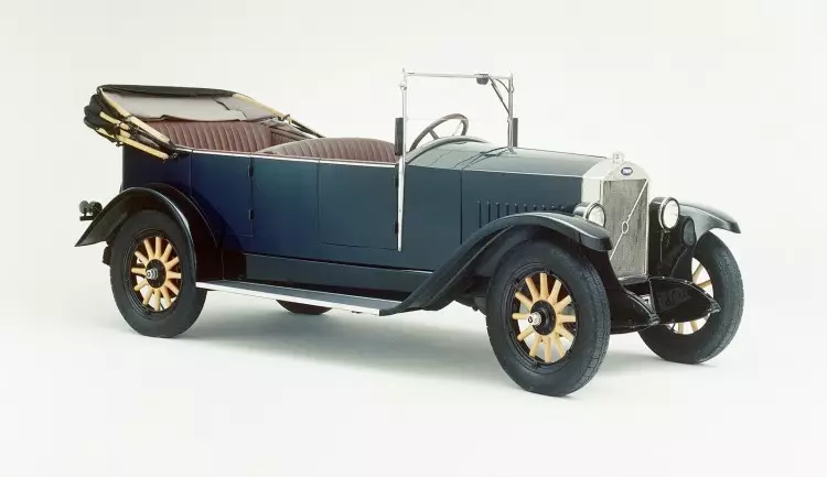
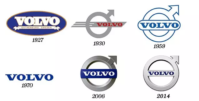
Volvo's first official logo was registered in 1927, just before the launch of the Swedish brand's first model, the Volvo ÖV 4 (below). In addition to the blue circle with the brand name in the center, the ÖV 4 contained a diagonal metal band that ran through the front grille.
Three years later, Volvo ended up putting this symbol in the form of an arrow pointing to “northeast” on the emblem itself.
The symbol turned out to be controversial – it was even contested by European feminist movements – but contrary to what it might seem, this image has nothing to do with the male sex symbol.
So where does the brand symbol come from?As is known, one of the best steels in the world comes from Sweden. To take advantage of this centenary recognition, Volvo decided to use the chemical symbol of iron (a circle like an arrow), in analogy to the quality of steel used in its models. The idea of the Swedish brand was to convey a strong, stable and durable image of its cars, and associating its brand image with an already recognized symbol greatly facilitated the transmission of that message.
SEE ALSO: Volvo XC40 and S40: the first images of the concept that anticipates the 40 series
Another underlying theory (complementary to the above) is that the circle with a diagonal arrow is also the symbol of the planet Mars, which could convey an ambitious vision of Volvo for the future.Over the years, the logo has been modernized – chrome effect, in three dimensions, etc… – without ever losing its identity or the main elements. Moreover, like the symbol, the brand's models continue to excel in their image of safety and durability.
Do you want to know more about other brands' logos?
Click on the names of the following brands: BMW, Rolls-Royce, Alfa Romeo, Peugeot, Toyota, Mercedes-Benz. Here at Razão Automóvel, you will find a «history of the logos» every week.